
20th Century Type - Lewis Blackwell
Pagá en cuotas
Llega el sábado
Solo en CABA y zonas de GBA
Comprando dentro de las próximas 3 h 19 min
Beneficio Mercado Puntos
Retirá entre el lunes y el jueves 9/mayo en correo y otros puntos
Ver en el mapa¡Última disponible!
+100 ventas
Información sobre el vendedor
- +100
Ventas concretadas
Brinda buena atención

Despacha sus productos a tiempo


Medios de pago
Hasta 12 cuotas sin tarjeta

Tarjetas de crédito


Tarjetas de débito


Efectivo


Características del producto
Características principales
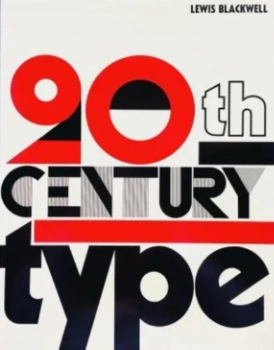
Título del libro | 20th Century Type - Tapa Dura |
|---|---|
Subtítulo del libro | No |
Serie | 1 |
Autor | Lewis Blackwell |
Idioma | Inglés |
Editorial del libro | Yale University Press |
Edición del libro | 1 |
Tapa del libro | Dura |
Con índice | Sí |
Año de publicación | 2002 |
Otras características
Cantidad de páginas | 250 |
|---|---|
Altura | 30 cm |
Ancho | 26 cm |
Peso | 190 g |
Con páginas para colorear | No |
Con realidad aumentada | No |
Género del libro | Diseño,ILustración,diseño grafico |
Subgéneros del libro | Arte |
Tipo de narración | Manual |
Colección del libro | Enciclopedia de Diseño |
Accesorios incluidos | sobrecubierta |
Edad mínima recomendada | 12 años |
Edad máxima recomendada | 100 años |
Descripción
:En muy buen estado. Solo un poco de desgaste en algunos sectores de la cubierta.
Se retira por Palermo CABA (Zona Av. Scalabrini Ortiz y Av. Córdoba).
- Entregas Rápidas en Palermo (económicas o gratuitas) según la zona. (consultar).
- O bien entregas por mercado envíos.
- Consulte por importantes descuentos con medios de pago combinados (efectivo).
Su pregunta no molesta.
Sobre la obra:
Twentieth-Century Type surveys the significant issues that have shaped the history and evolution of typography and graphic design, showing how current typographic trends are part of a continuously changing movement that can be plotted through the decades. Generously illustrated with over three hundred examples-more than two hundred of which are in color-the book charts significant topics including the arrival of mass-production; the birth of the art director; the appearance of the grid (and its subsequent rejection); the coming of non-print media; and the launch of the Macintosh computer and its ushering in of a new generation of designers enfranchised by digital technology.
This revised edition of a fundamental work brings the story up to date with new text and images covering type on screen and, in particular, type for the internet. Combining an assessment of the culture of experimentation in contemporary typographic design alongside a clear presentation of the fields historical context, the book is an informed and accessible source for all students of design and for designers needing an expert overview of typography.
1890:
The development of mechanised typesetting.
The growth of demand for print and the implications for type and typography.
William Morris and the private press movement.
Art Nouveau and the freedom of lithography.
People: Beggarstaff Brothers, Linn Boyd Benton, Tolbert Lanston, Ottmar Mergenthaler, William Morris.
Typefaces: Akzidenz Grotesk, Cheltenham, Golden, Grasset.
1900:
Art and design movements question nineteenth-century values, with new ideas spreading into typography.
Art Nouveau and Jugendstil.
Arts and Crafts and Wiener Werkstätte.
People: Peter Behrens, Morris Fuller Benton, Otto Eckmann, Koloman Moser.
Typefaces: Auriol, Doves, Eckmann, Franklin Gothic.
1910:
The impact of Cubism and Futurism.
Marinetti’s typographic revolution.
The Russian Futurists and Suprematists.
The beginnings of De Stijl and Dada.
Continuing mechanical advances in the speed, size and sophistication of setting possible with hot metal.
People: Guillaume Apollinaire, Frederic Goudy, Edward Johnston, Rudolf Koch, F. T. Marinetti, Bruce Rogers.
Typefaces: Centaur, Imprint, Johnston Railway Type, Kennerley, revivals.
1920:
Modernism and Revivalism both forge ahead.
The importance of typographic study at the Bauhaus, explored as abstraction, implementation and constituent of art and architectural thought.
The quest for simpler, purer type and layout through reductive geometrics.
The beginnings of the grid.
Asymmetry, sans serif and Tschichold’s “new typography” commandments.
In contrast, the principles laid down by Morison and others connected with The Fleuron.
The advance of revival designs.
Art Deco and the French poster artists.
People: Herbert Bayer, Eric Gill, El Lissitsky, Lászlo Moholy-Nagy, Stanley Morison, Aleksandr Rodchenko, Kurt Schwitters, Jan Tschichold, Hendrik Werkman, Piet Zwart.
Typefaces: Baskerville, Bembo, Bifur, Broadway, Cable, Gill, Futura.
1930:
Doubt and the new typography.
The impact of the Great Depression in the United States and growing political repression in Europe on the dimate for new ideas in art and design.
Commerce, compromise and emigration for the apostles of Modernism.
Keller, Williman, Bailmer, Bill and the origins of Swiss Style.
Surrealism and the typographic pun.
Early attempts at photosetting.
People: Theo Ballmer, Max Bill, Alexey Brodovitch, A. M. Cassandre, Herbert Matter, Albert Tolmer.
Typefaces: Beton, Peignot, Times New Roman.
1940:
War breaks the advance of ideas in Europe, cuts off investment and materials for new typefaces, but gives impetus to the adoption of exiled Modernists in the United States.
War poster work draws together the disparate directions of twentieth-century graphics.
Paul Rand indicates a direction for the look of post-war advertising.
Tschichold’s apostasy as he rejects the New Typography and embraces classicism.
People: Paul Rand, Bradbury Thompson, Jan Tschichold.
1950:
The revolutionary principles of the 1920s typographers and artists are now part of the establishment and, embodied in Swiss Style, are propagated as a comprehensive and reductive solution.
Meanwhile, Tschichold and others build the case for a new classicism, and commercial growth demands new choices in display typography.
Corporate design programmes become more sophisticated and stimulate typographic thought Investment in type technology lifts off and the first commercially viable photosetting systems are launched.
Television graphics begin to take their own form.
People: Roger Excoffon, Adrian Frutiger, Josef Muller-Brockmann, Hermann Zapf.
Typefaces: Banco, Helvetica, Optima, Palatino, Univers.
1960:
The arrival of “cold type’, transfer lettering, more media and the attack on professionalism and traditional craft.
The golden age of American advertising and the typographic pun: the spread of
American ‘conceptual” graphics into Europe.
Pop Art, psychedelia and communication design.
Readability becomes more complex.
People: Willi Fleckhaus, Adrian Frutiger, Herb Lubalin, Victor Moscoso.
Typefaces: Antique Olive, Eurostile, OCR-A, Sabon.
1970:
The decline of metal setting and concern at lowering of standards.
The proliferation of typographic routes, as electronic sethng begins to appear.
The explosion of information leads to a wide range of attempts to improve communication across different media: typography is now being clearly seen as a discipline that extends beyond print into television and other graphic communication, such as pictograms.
International Typeface Corporation puts down a marker for the type designer’s rights.
Wolfgang Weingart and the New Wave provide a new perspective on the conventions of readability, as does Punk.
People: Oti Aicher, Herb Lubalin, Wolfgang Weingart.
Typefaces: American Typewriter, Bell Centennial, Frutiger, Galliard.
1980:
Digital typesetting takes over and with it come new powers in type design and manufacturing.
The significance of PostScript as a language that unites different systems.
Lowcost computer technology takes control out of the hands of the specialist typesetter.
From Matthew Carter and the rapid growth of the Bitstream library, to the “school” of selfconscious typography projected by (among others) Neville Brody in London, Rudy VanderLans and Zuzana Licko in California, Tibor Kalman in New York.
A rich vein of nostalgia is present in a wide range of commercial work, taken to sophisticated heights in Rolling Stone, while minimalism is refined by a few, such as Peter Saville.
People: Neville Brody, Matthew Carter, Gert Dumbar, Zuzana Licko, Katherine McCoy, Peter Saville. Rudy VanderLans.
1990:
The ever-changing conception of type — from cold metal to hot metal to film to digital information and several thousand faces on a compact disc.
The demand for old standards in the new technology while the potential of digital information opens up new possibilities.
Type design becomes a cottage industry.
Questioning and experimentation continue around the concept of readability.
The potential shift of typography from a specialist craft to a common area of knowledge embraced as part of computer literacy.
This volume also includes work by Josef Albers, M. F. Agha, Guillame Apollinaire, Herbert Bayer, Lester Beall, Max Bill, Will Bradley, Alexey Brodovitch, Neville Brody, Jean Carlu, David Carson, A. M. Cassandre, Oswald Cooper, Fortunato Depero, Theo van Doesburg, Frederic Goudy, April Greiman, John Heartfield, Johannes Itten, Leo Lionni, Zuzana Licko, El Lissitzky, Laszlo Moholy-Nagy, Bruno Monguzzi, Paul Renner, Paul Rand, Alexander Rodchenko, Kurt Schwitters, H. N. Werkman, Piet Zwart, Paul Schuitema, Jan Tschichold, Joost Schmidt, Ladislav Sutnar and hundreds of other graphic designers from around the world.
Preguntas y respuestas
¿Qué querés saber?
Preguntale al vendedor
Nadie hizo preguntas todavía.
¡Hacé la primera!